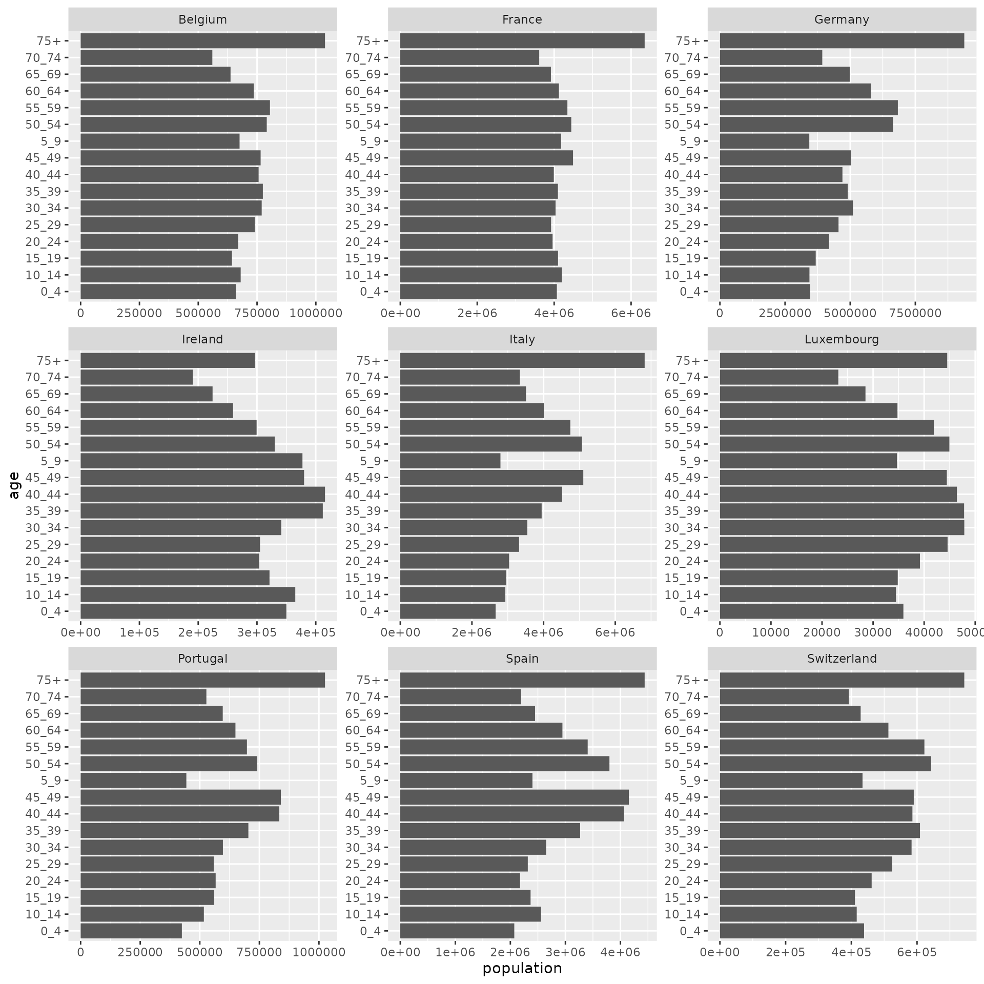
In this vignette, we are going to try to visualise the age pyramid for 9 Western Europe countries. The list of these countries is:
countries <- c("Portugal", "Spain", "Italy", "France", "Ireland", "Belgium", "Luxembourg", "Germany", "Switzerland")We can get the contact data for all these countries in a single function call with:
age_data <- age_df_countries(countries)For the visualisation itself, we use the graphical package ggplot2, which offers a large flexibility in terms of customisation:
library(ggplot2)
ggplot(age_data, aes(x = population, y = age)) +
  geom_bar(stat = "identity") +
  facet_wrap(~country, scales = "free")